This year’s Dulux Colour Awards winners, announced last night in Melbourne, uniquely demonstrate the capacity for colour to transform our built environment through innovative design, ambitious scope and masterful execution.
Chosen from 113 finalists across New Zealand and Australia the winning projects were applauded for their exceptional use of colour across a vast range of scales and typologies. In recognising these outstanding designs, the judges acknowledged the people at the heart of each project – those creating them and those inhabiting them.
")
Grand Pix New Zealand Winner
PROJECT: ST JAMES THEATRE (NZ)
ARCHITECTURE/DESIGN PRACTICE: SHAND SHELTON
KEY DULUX COLOURS: DULUX® ROSEWOOD, DULUX® WAIAU BAY HALF AND DULUX® VINTAGE GOLD
JUDGES’ COMMENTS:
“The revitalisation of the St James Theatre in Wellington is a celebration of craftsmanship and a gift to the community. The architects have embraced the challenge, specifying a complex palette, inspired by early drawings of the heritage-listed building. These artistic effects
enhance the intricate plasterwork within the auditorium, while blushes of rich colours and metallics strategically accentuate the proscenium-arch and stage. By contrast, the foyer spaces adopt a neutral colour scheme to emphasise the building’s materiality, with feature colours reserved for focal points. It is an impressive display of colour conceptualisation and workmanship.”
")
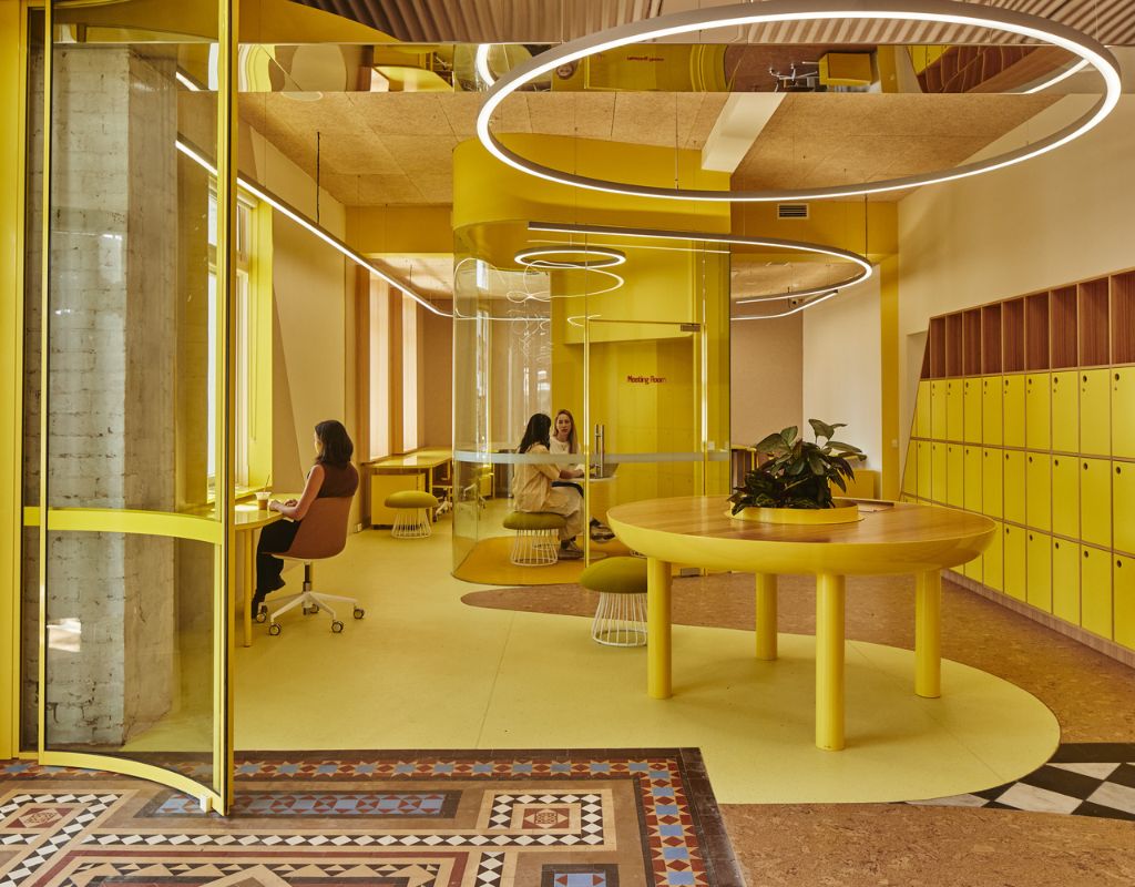
Grand Pix Australian Winner
PROJECT: DAREBIN INTERCULTURAL CENTRE
ARCHITECTURE/DESIGN PRACTICE: SIBLING ARCHITECTURE
KEY DULUX COLOURS: DULUX® KOWLOON AND DULUX® CIRCUS
JUDGES’ COMMENTS:
“This meticulously ambitious project truly represents everything that the Dulux Colour Awards programme is about; it pushes the boundaries and creates precedence, not only in its colour usage but its typology. The deliberate avoidance of any recognisable cultural representation placed greater importance on the
form and material palette, and we applaud the strong tie to the brief, achieved through the push and pull of colour and texture.
")
Single Residential Exterior
ARCHITECTURE/DESIGN PRACTICE: FABRIC
KEY DULUX COLOURS: DULUX® MIST GREEN
JUDGE’S COMMENTS BY SARAH CARNEY:
“A kernel of delight set into the landscape of the Banks Peninsula in New Zealand, this modest structure demonstrates the way a subtle incorporation of colour, applied with constraint, can have a powerful effect. In spite of its utility as a services and storage shed, it has been elevated to become a sophisticated light sculpture with timeless relevance, well integrated into the landscape,” says Carney. “Undoubtedly, it asks a lot from one colour, which gives us more reason to commend the
choice of Mist Green, as it sits so comfortably with the structural timbers and myriad greens of the surrounding bush. The result is calm and sincere, striking an organic balance between form and function.”
")
Residential interior
PROJECT: ALMA ROAD RESIDENCE
ARCHITECTURE/DESIGN PRACTICE: STUDIOFOUR
KEY DULUX COLOURS: DULUX® FERNHILL AND DULUX® MT ASPIRING
JUDGE’S COMMENTS BY LISA LEE:
“A theatrical yet calm, moody interior exuding timeless old-world sophistication typifies this period restoration and, although it is clearly controlled, it feels effortless,” says Lee. While it doesn’t rely on trickery, the play of grey and white, matte and gloss, is deceptively complex. “What appears to be a highly wrought design execution nevertheless allows its function as a
family home to remain evident and the warmth that pervades this project is ultimately seductive.”
")
Commendation
PROJECT: STUDIO ELROY
ARCHITECTURE/DESIGN PRACTICE: LINTEL STUDIO FOR ARCHITECTURE
KEY DULUX COLOURS: DULUX® RANGITOTO AND DULUX® CARDRONA
“Although the architects state that their choice of rich cochineal red was ‘as much an experiment as a statement’, everything feels enhanced by their commitment to its application,” says Lee. “As this tiny home remarkably accommodates a queen-size bed, a home-office workstation, a kitchen and living space, wine cellar, and bathroom, the saturated colour soothes the complex programme and its
taut orchestration. Notably, the passing of time, somewhat compromised by the limited natural light, is cleverly marked by painted and tiled surfaces with changing shades of salmon through to garnet emerging as sunlight and shadow play across them. This is commendable for its unabashed commitment to all-encompassing colour usage.”
")
Commendation
PROJECT: MOUNT MAC
ARCHITECTURE/DESIGN PRACTICE: WILLIAMS BURTON LEOPARDI
KEY DULUX COLOURS: DULUX® WIGRAM AND DULUX® TE KUITI
“Grounded by its connection to place, Mount Mac demonstrates an honest design approach to the recrafting of the interior, now oozing with warmth and texture. At its core is the identity of its owners, their lineage and relationship with the surrounding landscape and farming context. First impressions are of a sophisticated, hotel-like sleekness, created by the deep dramatic colour scheme of the kitchen and living zones.
Here, the effect of deep green and dark grey is cocooning and seductive,” says Lee. “Settling into the home, the role of the overall palette becomes evident; its sincerity and simplicity finely balanced with the earthiness of natural finishes in timber, stone and brick. Special mention should be made of the considered styling, especially the inclusion of a light-citrus upholstery, which adds to the overall impression of nuanced effortlessness.”
")
Commercial Interior Work and Retail
PROJECT: POSTAL HALL
ARCHITECTURE/DESIGN PRACTICE: TROWER FALVO ARCHITECTS WITH ALESSIO FINI
KEY DULUX COLOURS: DULUX® MIST GREEN
JUDGE’S COMMENTS BY BYRON GEORGE:
“Unanimously commended, this bookshop, within the century-old Postal Hall at the heart of Perth’s State Buildings complex, is another hugely successful example of the impact of a singular colour. “This response is strong and sophisticated: the sage green of the shelving modules against the white canvas tones is refined and striking, complementing the
heritage context while establishing its own distinctly contemporary identity. Combined with the pops of blue furniture around the bookstore’s perimeter, there is a joy and beauty to this unique project. It is cohesive, compelling, and extremely clever.”
")
Commercial and Multi; Residential Exterior
PROJECT: PHIVE COMMUNITY, CULTURAL AND CIVIC HUB
ARCHITECTURE/DESIGN PRACTICE: DESIGNINC SYDNEY
KEY DULUX COLOURS: DULUX® DEVILS STAIRCASE, DULUX® DEEP GARNET AND DULUX® TE AWAMUTU
JUDGE’S COMMENTS BY SARAH CARNEY:
“The multi-storey structure’s vibrant external envelope comprises hundreds of powder-coated folds, which open successively to the west and the east, to the adjacent public square and the
sky. Shading the interior from the sun’s heat while also allowing natural light in, the pattern of solid and open elements is eye-catching for the spectrum of red and tangerine hues that colour its geometric filigree. It is an outstanding concept, boldly executed, and an invaluable contribution to the typology and context.”
Student Category
")
Winner- New Zealand
PROJECT: THE CANOPY BENCH
STUDENT: AUGUSTINA BINYAMIN – VICTORIA UNIVERSITY
KEY DULUX COLOURS: DULUX® HOG BRISTLE IN DURAMAX
“Although inspired by the forest, a literal colour for the Canopy Bench was eschewed in favour of the clarity of Hog Bristle®. This design decision allows the purity of the bench’s form to speak for itself and its singularity is so effective that it sparked rigorous discussion about the role and use of colour in design, ultimately proving that it doesn’t have to be a bright colour to stand out. We congratulate the designer for this exquisite concept and resolution.”
")
Winner – Australia
PROJECT: HUES OF MOUNT KUNANYI
STUDENT: RUBY SHIELDS – ROYAL MELBOURNE INSTITUTE OF TECHNOLOGY (RMIT)
KEY DULUX COLOURS: DULUX® MYSTIFICATION AND DULUX® BANKSIA LEAF
“Artistic, imaginative and playful, the Hues of Mount Kunanyi boutique hotel is a highly sophisticated design concept inspired by the mountain that looms over Hobart and, specifically, the Eucalypts that populate the area. Their green leaves and blue oil-haze hues are echoed in the palette, with bursts of orange scattered throughout to emulate the sun’s glint on the limestone rocks atop the mountain at sunset,”
explains Lucena-Orr. “It is a whimsical yet mature and worthy winner.”
Check out their website to see more information and more photos of these beautiful designs here.!
What color scheme would you pick for your room?
Supplied by Undertow Media


Leave A Comment
You must be logged in to post a comment.